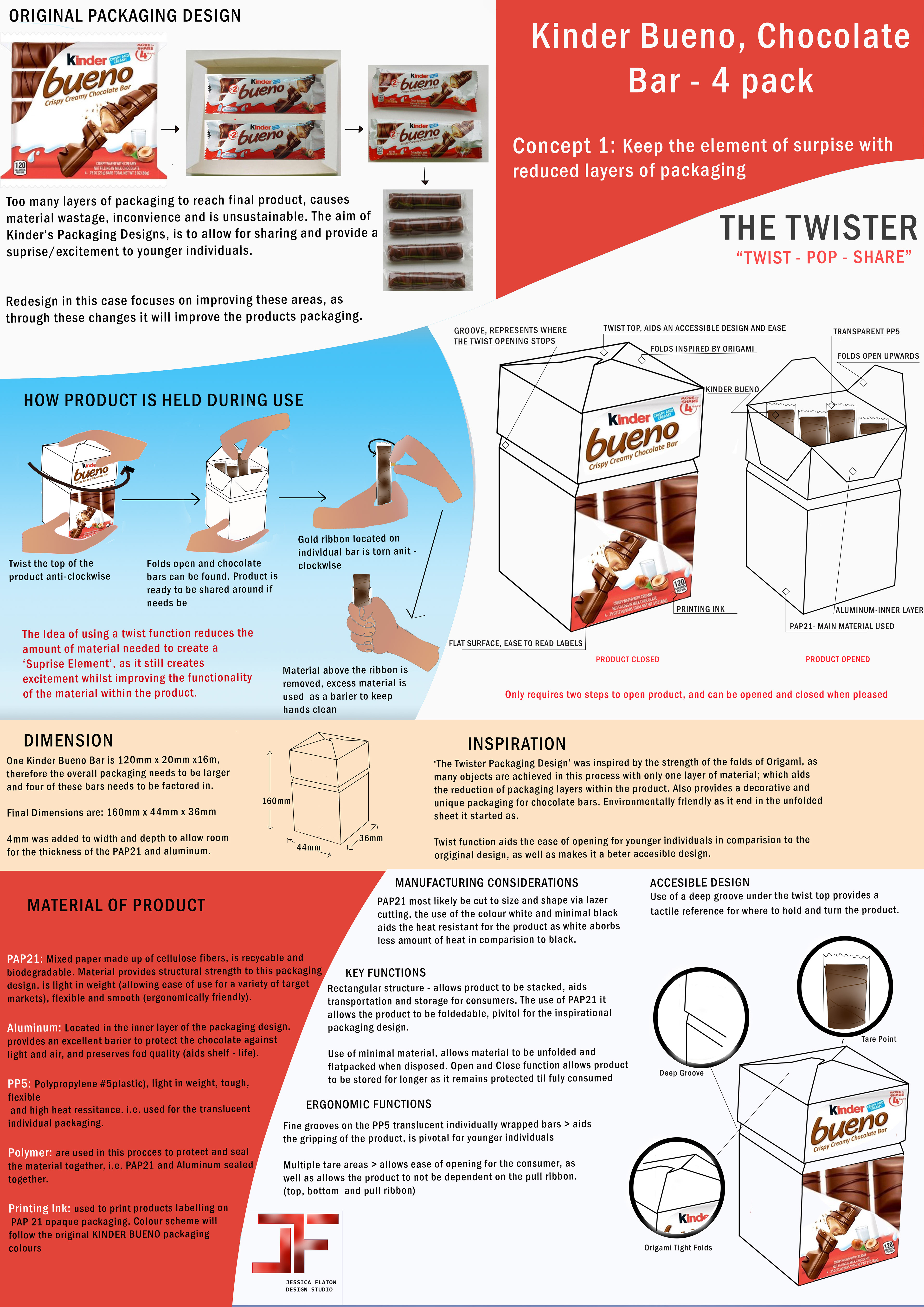
Concept 1: The Twister , 'TWIST - POP - SHARE'
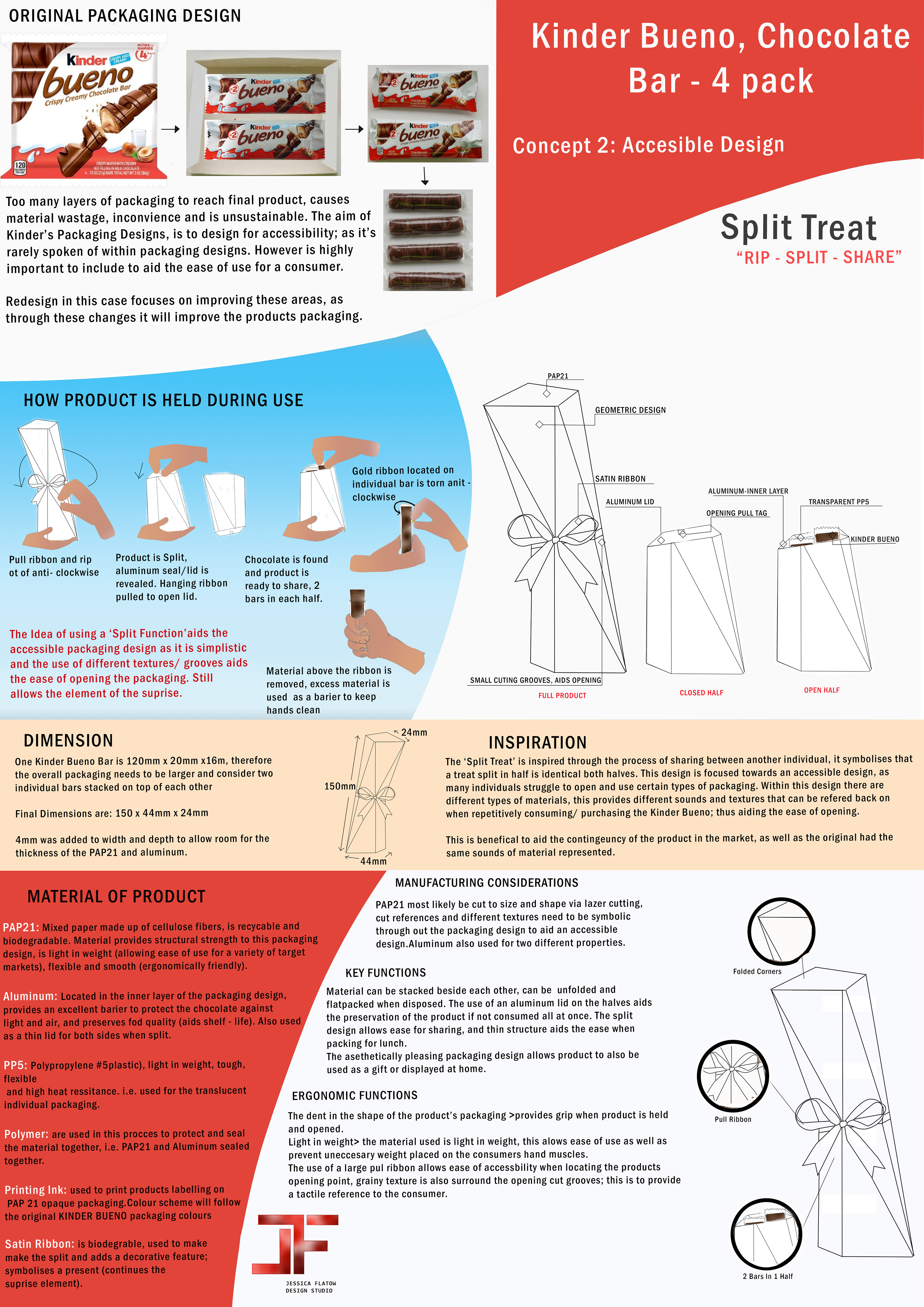
Concept 2: Split Treat , 'RIP - SPLIT - SHARE'
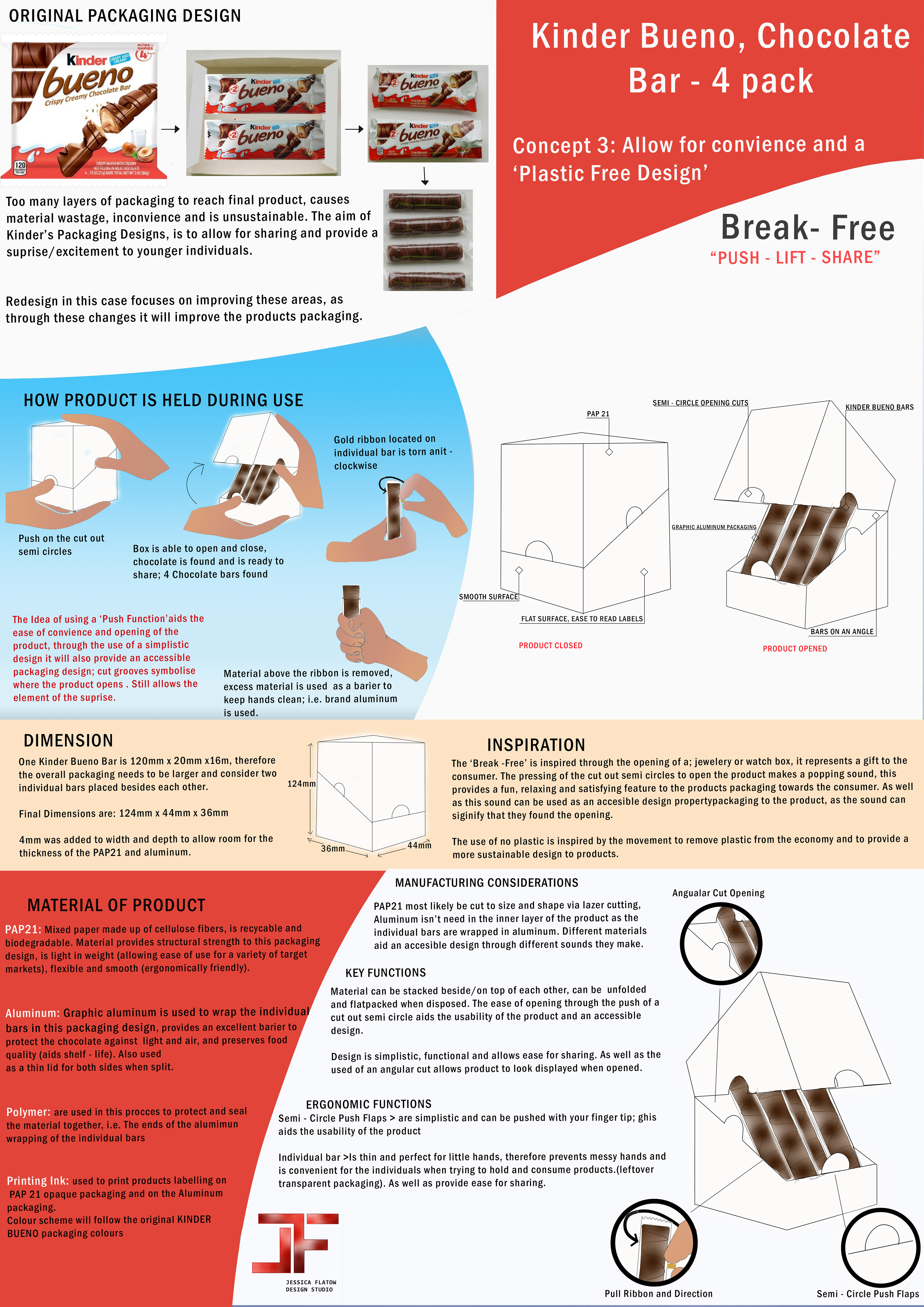
Concept 3: Break Free , 'PUSH - LIFT - SHARE'
Project Description:
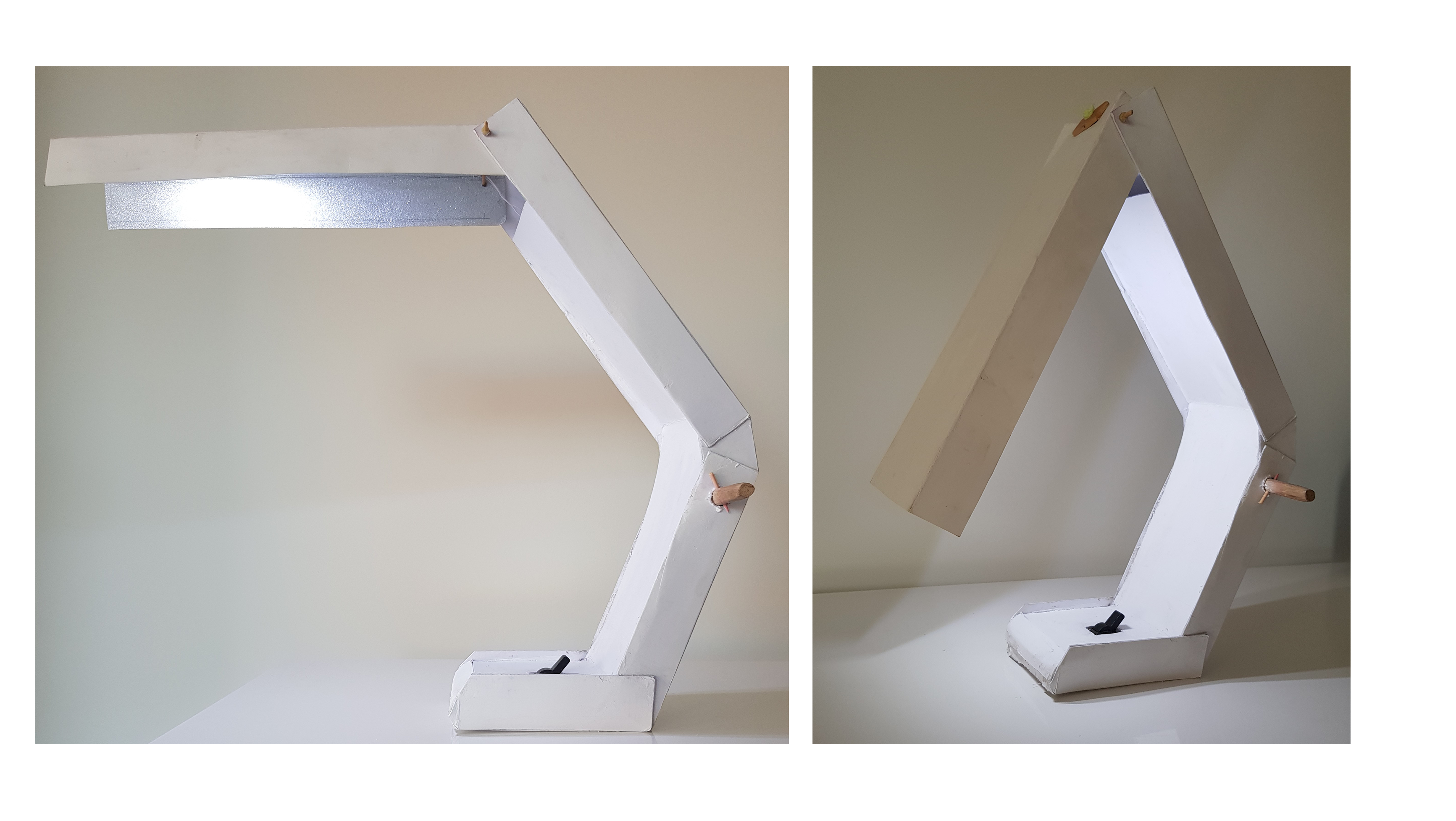
This project was aimed around design semantics, and redesigning an already existent product to be inclusive, sustainable and represent semantics and other elements. In this case, the product represented above wasn’t meeting the need and resembled many constraints to certain users; which in turn led to the idea to redesign the product. This was both an individual and group task, the conceptual idea was developed individually and as a group, we worked on developing the prototype.
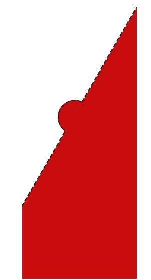
The Break-Free, 'PUSH - LIFT - SHARE', was the conceptual design that was selected collaboratively out of the three designs. Conceptual design one was trialled, however, due to limited access to material and time, design three felt best suited. The idea behind this design was to aid ease of convenience whilst maintaining the element of surprise, that the brand itself is known for. This brand is known to be catered towards children, as 'Kinder' in German means children and 'Bueno' means good in Spanish; thus when creating the logo the cultural reference and brand meaning weren't diminished. In this design the name remained the same, however, the addition of the word 'Vier', which means four in German, was implemented along with different colours and fonts to represent the differentiation between the original and new packaging design. This simplistic opening mechanism (push and lift), it allows ease for all users and works well when on the go.
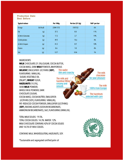
The original 'Kinder Bueno 4 pack' packaging design consisted of too many layers of single-use plastic, there was more packaging thrown away than what the user would consume. This does not only cause an inconvenience but it is an unsustainable packaging design, as it is prompting high amounts of single-use plastic to be readily produced.
Collaborative Hand - Made Cardboard Prototype
`Packaging/ Food Product Labelling Design:
Front View: Packaging Design
Left View: Packaging Design
Back View: Packaging Design
Right View: Packaging Design
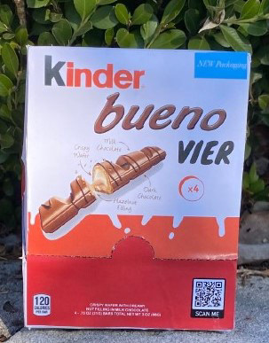
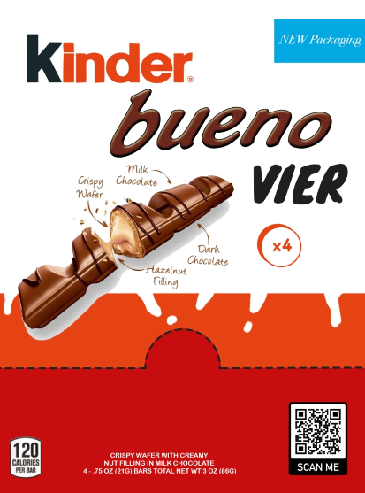
This is the final packaging label design that was created for the final prototype, this was illustrated by another group member through the use of Adobe Photoshop; however, it was through collaborative input that the final design came about. We also decided to place a QR code on the front of our packaging design, this is to provide additional information about the product as it links to the main Kinder website.
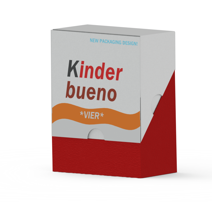
Kinder Bueno Vier Packaging Redesign - Solidworks Rendering
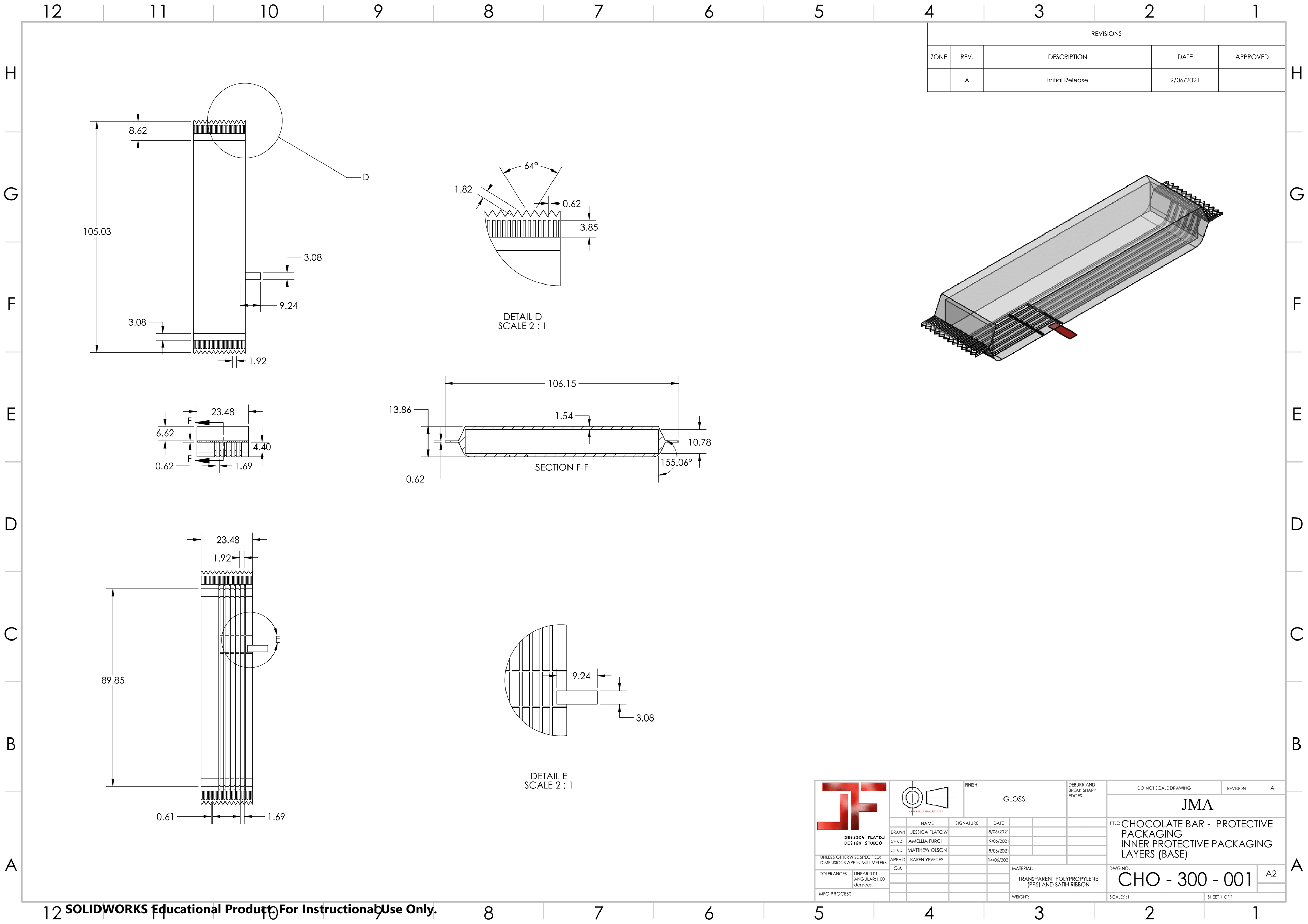
Rendering and Engineering AS1100 Drawing Sheets:
The use of 3D CAD Modelling via Solidworks, Hands on Model Making, Adobe Photoshop and Hand Drawn Sketches all aided the journey to the production of the end product (as seen above and below). Overall, this collaborative project further enhanced my understanding of inclusivity, designing for users, sustainability, material usage and CAD skills.
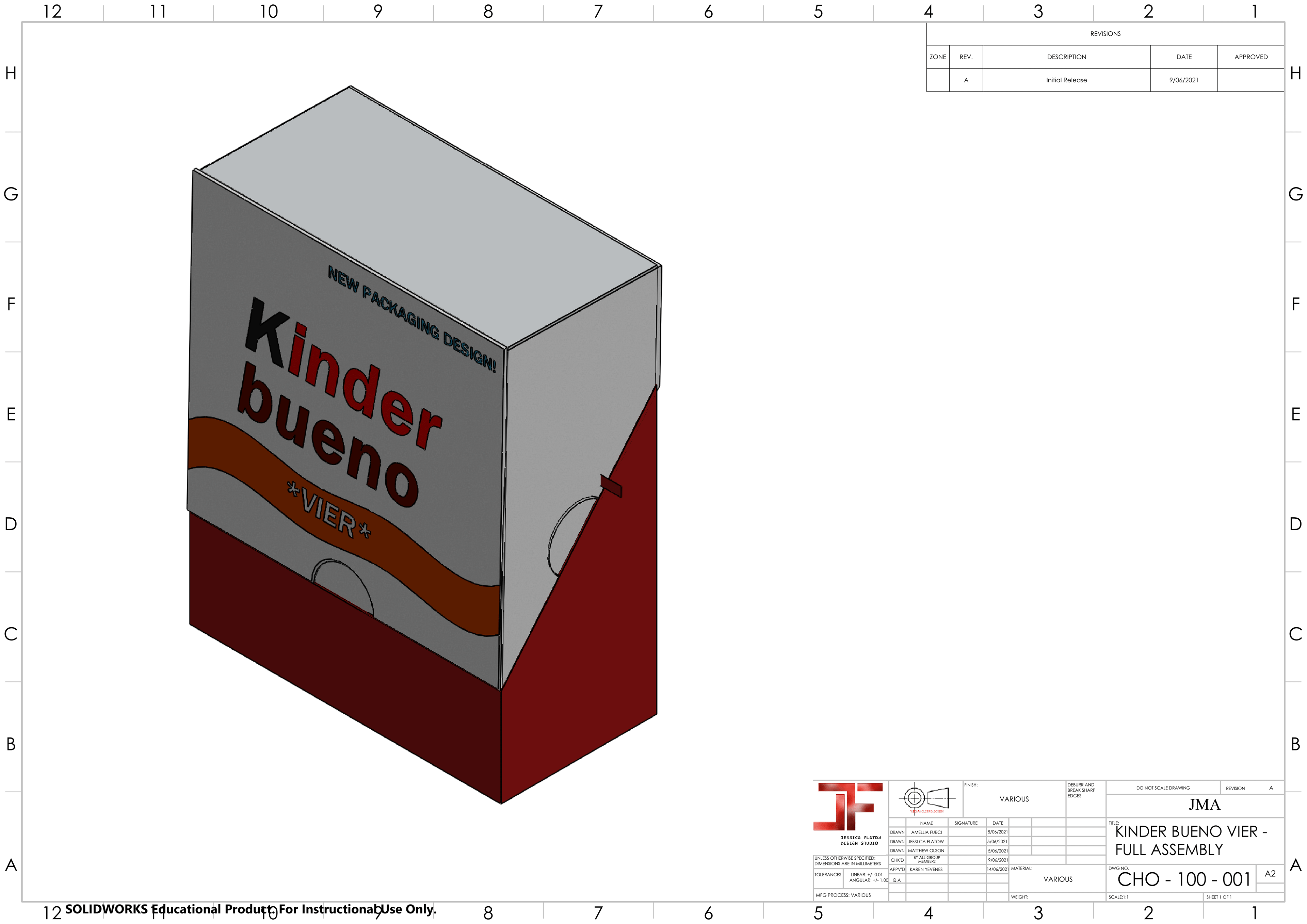
Full Assembly
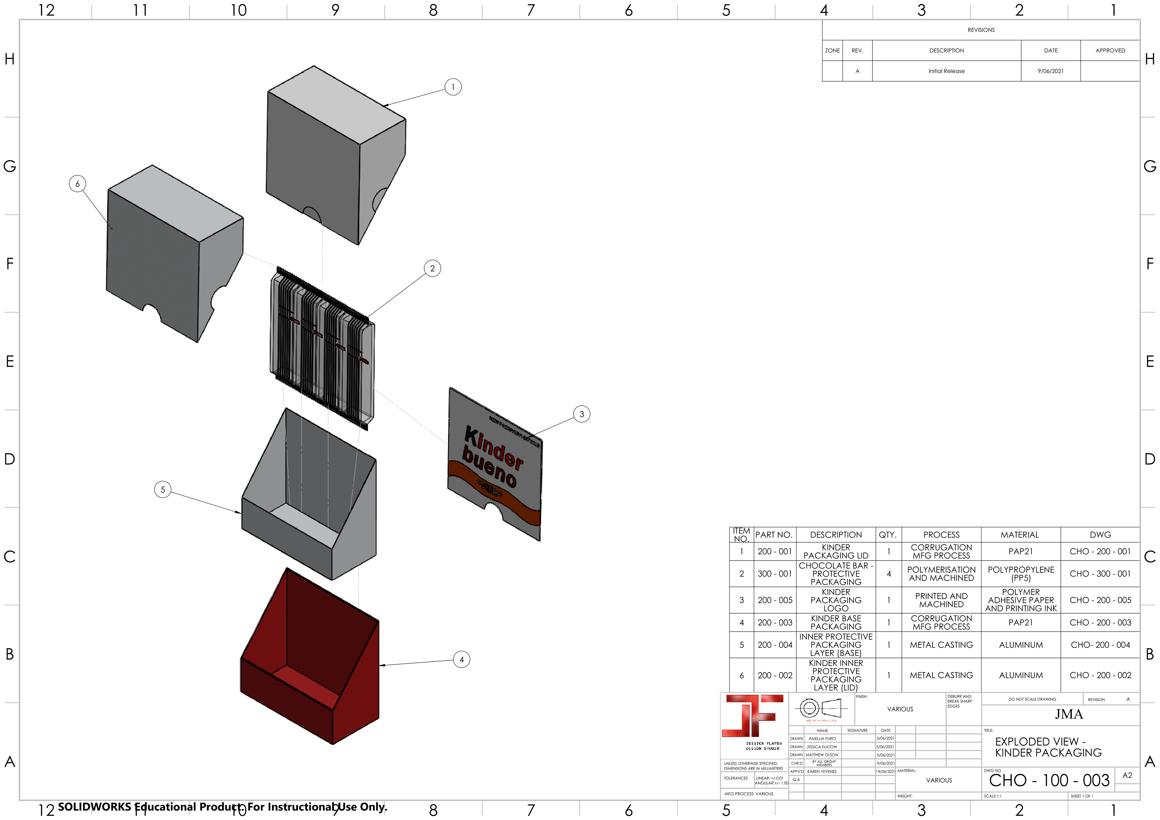
Exploded View
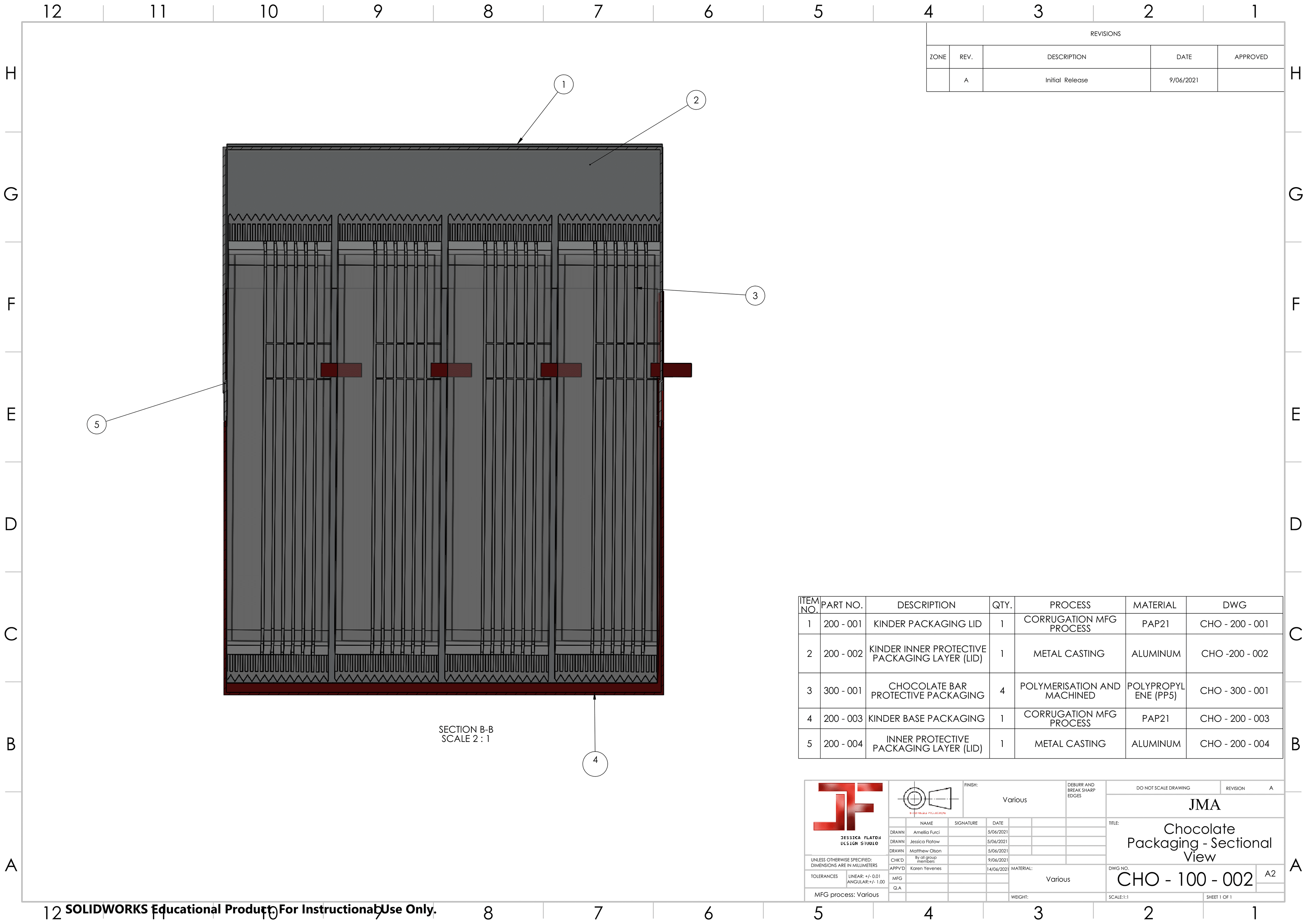
Internal Sectional View
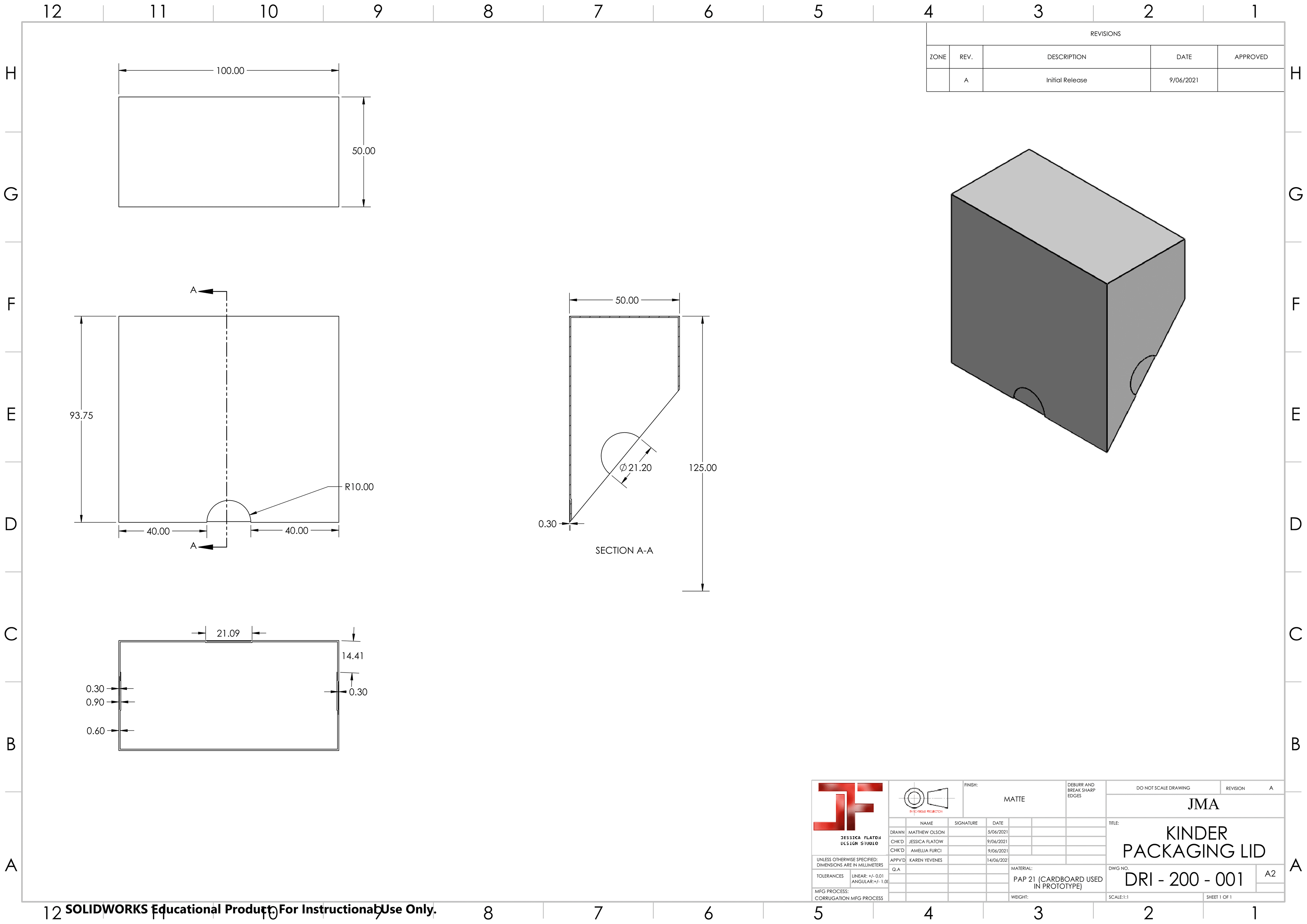
Lid
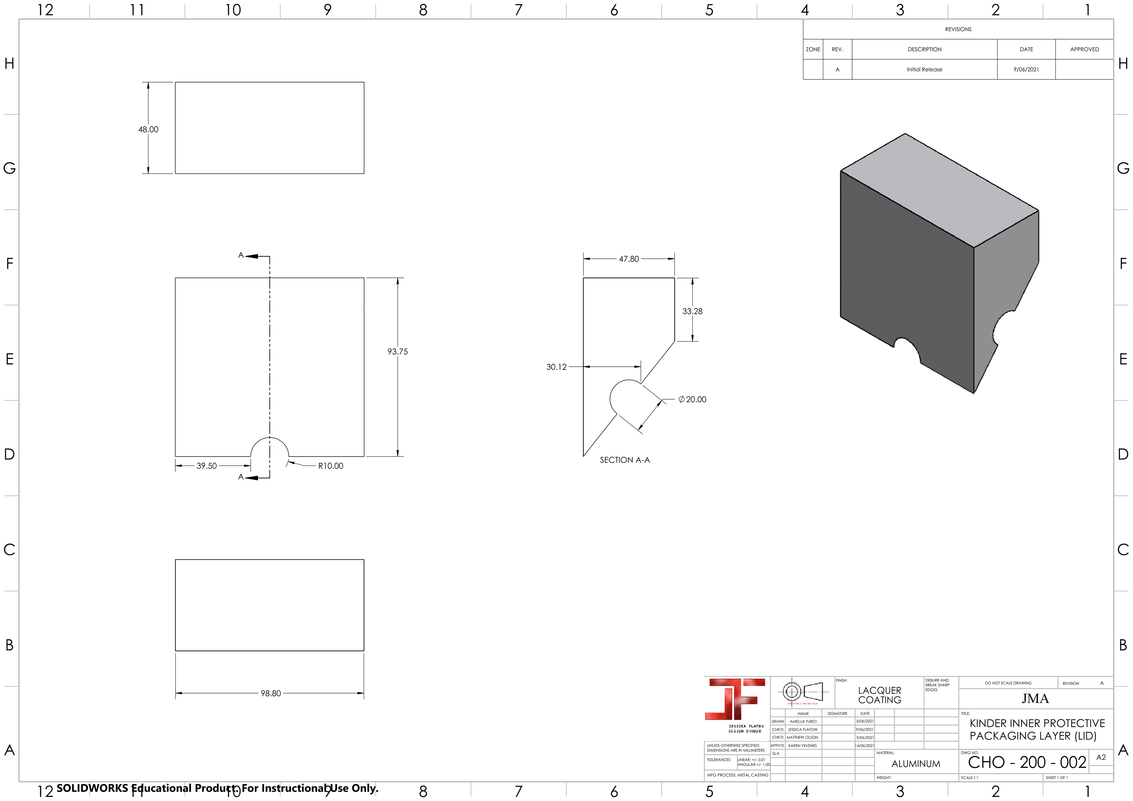
Inner Protection for Lid
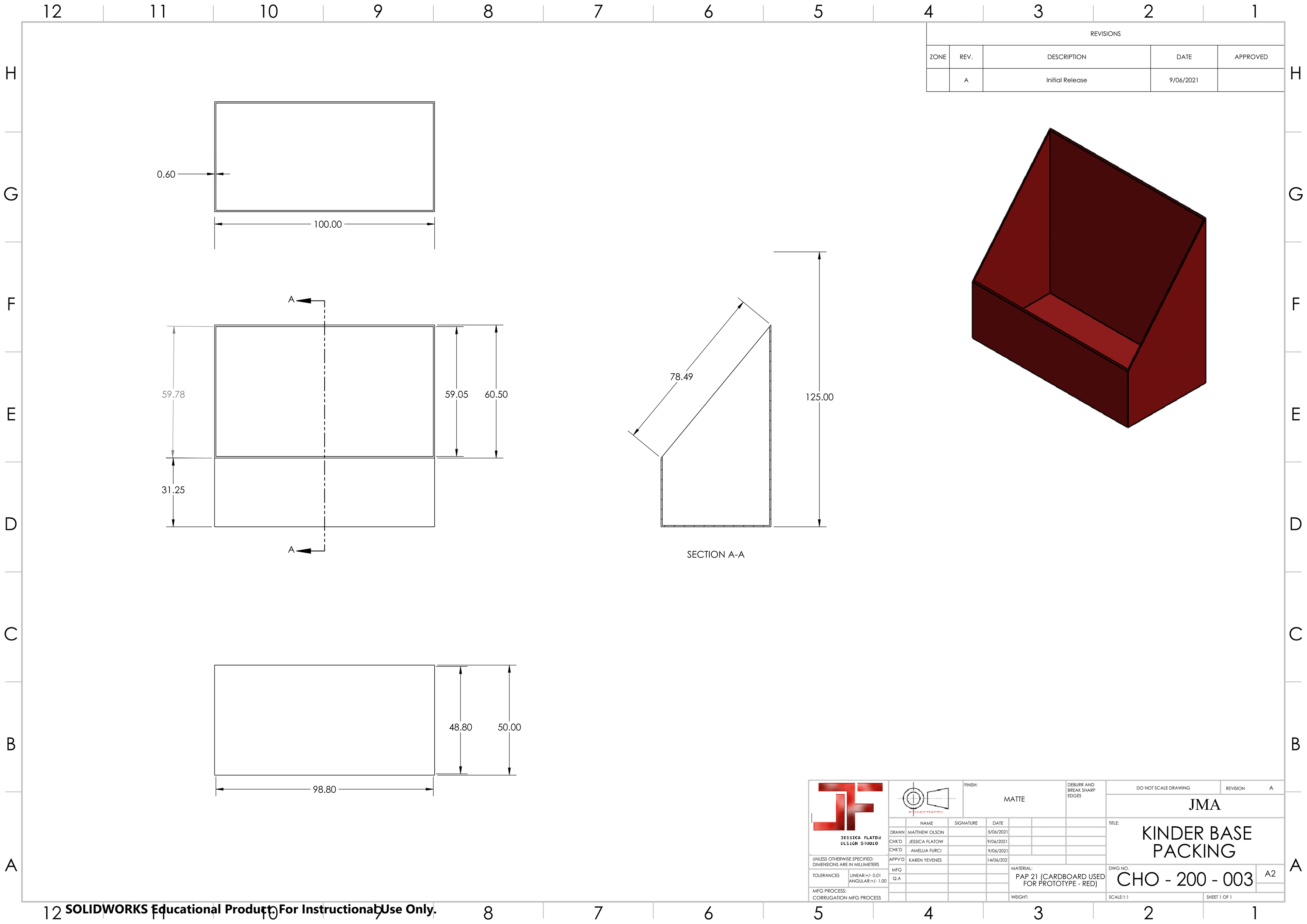
Base
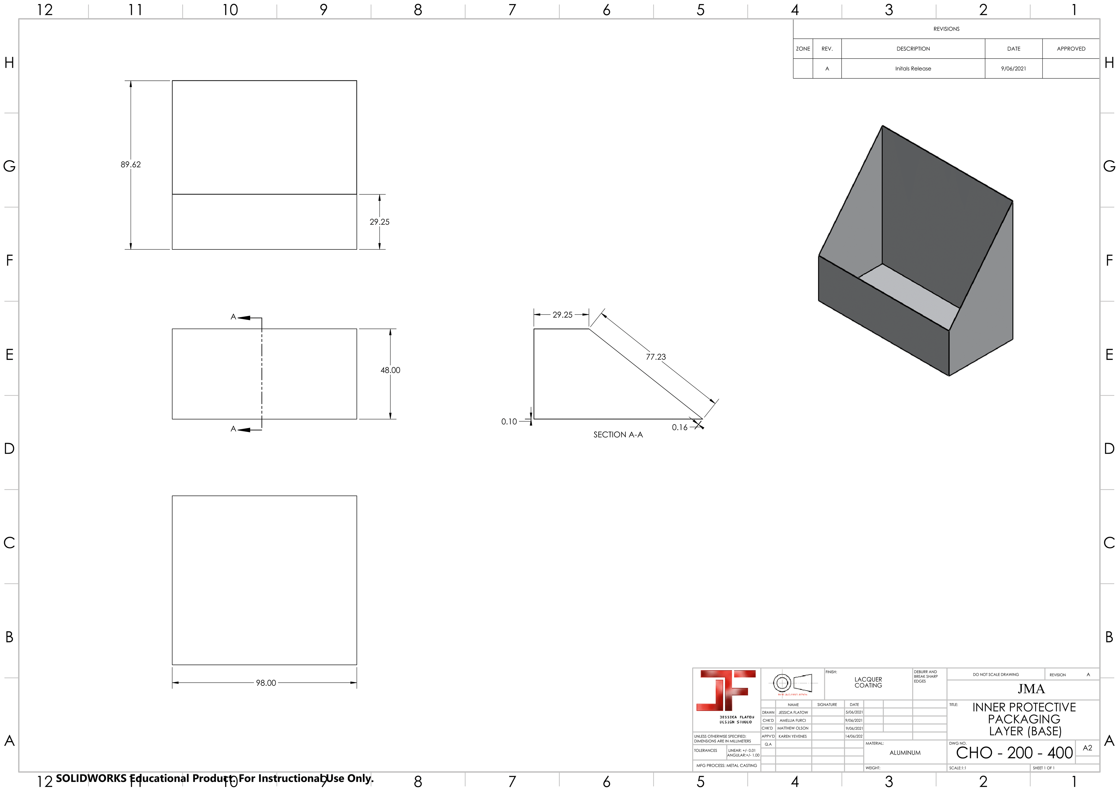
Inner Protection for Base
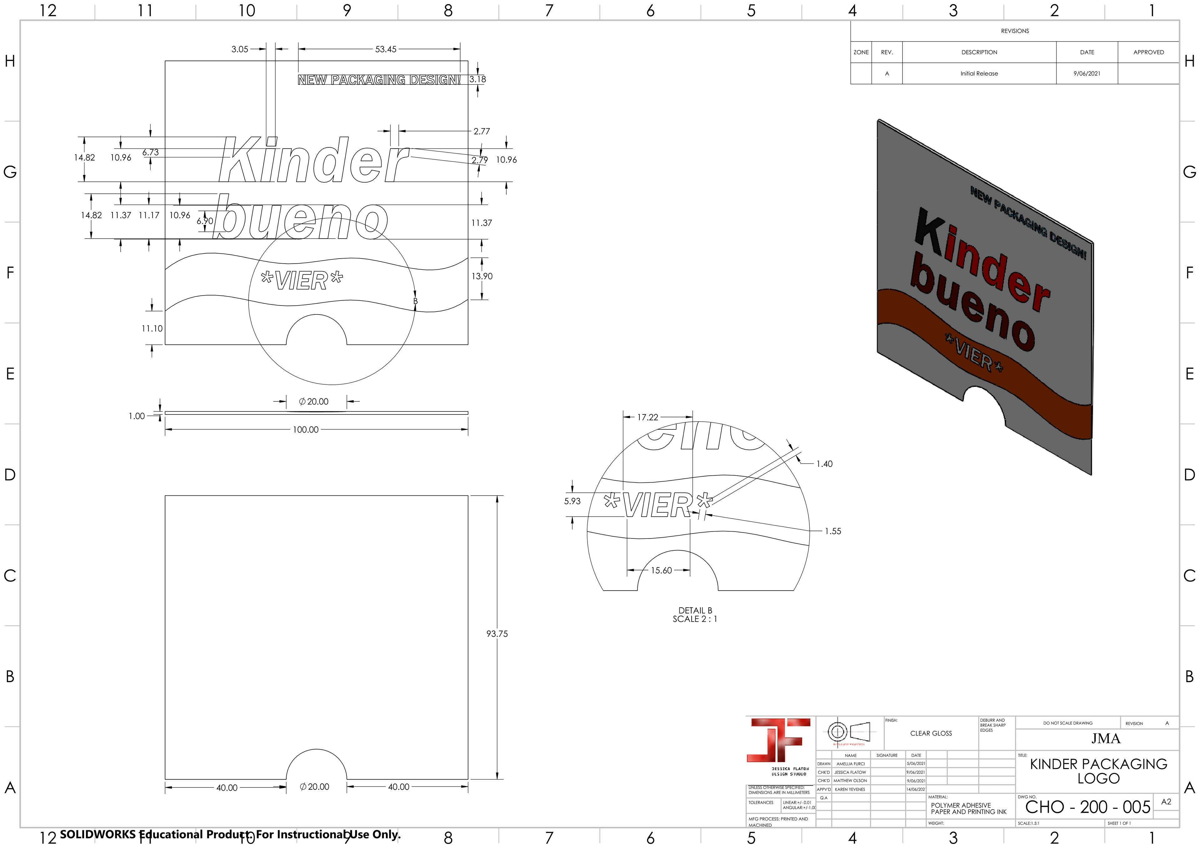
Logo